Gradients
https://www.w3schools.com/css/css3_gradients.asp
3 종류의 gradients
1. Linear Gradients
background-image: linear-gradient(direction, color-stop1, color-stop2, ...);
direction 은 다음과 같다.
to top,
to right,
to bottom,
to left,
to top right,
to top left,
to bottom right,
to bottom left
<!DOCTYPE html>
<html>
<head>
<style>
#grad1 {
height: 200px;
background-color: red; /* For browsers that do not support gradients */
background-image: linear-gradient(red, yellow);
}
</style>
</head>
<body>
<h1>Linear Gradient - Top to Bottom</h1>
<p>This linear gradient starts red at the top, transitioning to yellow at the bottom:</p>
<div id="grad1"></div>
</body>
</html>
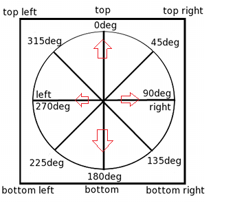
Angle을 사용하여 지정할 수 도 있다.
0deg is equivalent to "to top".
90deg is equivalent to "to right"
180deg is equivalent to "to bottom".
#grad {
background-image: linear-gradient(180deg, red, yellow);
}
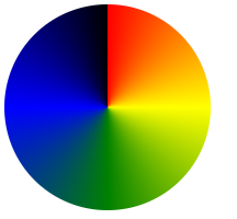
Rainbow Background
<!DOCTYPE html>
<html>
<head>
<style>
#grad1 {
height: 55px;
background-color: red; /* For browsers that do not support gradients */
background-image: linear-gradient(to right, red, orange, yellow, green, blue, indigo, violet);
}
</style>
</head>
<body>
<div id="grad1" style="text-align:center;margin:auto;color:#888888;font-size:40px;font-weight:bold">
Rainbow Background
</div>
</body>
</html>
Repeating a linear-gradient
(예) repeating-linear-gradient(red, yellow 10%, green 20%);
<!DOCTYPE html>
<html>
<head>
<style>
#grad1 {
height: 200px;
background-color: red; /* For browsers that do not support gradients */
background-image: repeating-linear-gradient(red, yellow 10%, green 20%);
}
#grad2 {
height: 200px;
background-color: red; /* For browsers that do not support gradients */
background-image: repeating-linear-gradient(45deg,red,yellow 7%,green 10%);
}
#grad3 {
height: 200px;
background-color: red; /* For browsers that do not support gradients */
background-image: repeating-linear-gradient(190deg,red,yellow 7%,green 10%);
}
#grad4 {
height: 200px;
background-color: red; /* For browsers that do not support gradients */
background-image: repeating-linear-gradient(90deg,red,yellow 7%,green 10%);
}
#grad5 {
height: 200px;
background-color: red; /* For browsers that do not support gradients */
background-image: repeating-linear-gradient(45deg, red 0px, red 10px, red 10px, yellow 10px, yellow 20px);
}
</style>
</head>
<body>
<h1>Repeating Linear Gradient</h1>
<div id="grad1"></div>
<p>A repeating gradient on 45deg axe starting red and finishing green:</p>
<div id="grad2"></div>
<p>A repeating gradient on 190deg axe starting red and finishing green:</p>
<div id="grad3"></div>
<p>A repeating gradient on 90deg axe starting red and finishing green:</p>
<div id="grad4"></div>
<p>A repeating linear gradient with solid stripes:</p>
<div id="grad5"></div>
</body>
</html>
2. Radial Gradients
https://www.w3schools.com/css/css3_gradients_radial.asp

3. Conic Gradients
https://www.w3schools.com/css/css3_gradients_conic.asp