Overflow Property
CSS 오버플로 속성은 너무 커서 영역에 맞지 않는 콘텐츠를 어떻게 할 것인가를 제어합니다.
적용되는 전제조건은 block 속성이어야 하고 크기정보가 설정되어 있어야 한다.
visible - Default. The overflow is not clipped. The content renders outside the element's box
hidden - The overflow is clipped, and the rest of the content will be invisible
scroll - The overflow is clipped, and a scrollbar is added to see the rest of the content
auto - Similar to scroll, but it adds scrollbars only when necessary
<!DOCTYPE html>
<html>
<head>
<style>
#overflowTest {
background: #4CAF50;
color: white;
padding: 15px;
width: 50%;
height: 100px;
overflow: scroll;
border: 1px solid #ccc;
}
</style>
</head>
<body>
<h2>CSS Overflow</h2>
<p>The overflow property controls what happens to content that is too big to fit into an area.</p>
<div id="overflowTest">
This text is really long and the height of its container is only 100 pixels. Therefore, a scrollbar is added to help the reader to scroll the content. Lorem ipsum dolor sit amet, consectetuer adipiscing elit, sed diam nonummy nibh euismod tincidunt ut laoreet dolore magna aliquam erat volutpat. Ut wisi enim ad minim veniam, quis nostrud exerci tation ullamcorper suscipit lobortis nisl ut aliquip ex ea commodo consequat. Duis autem vel eum iriure dolor in hendrerit in vulputate velit esse molestie consequat, vel illum dolore eu feugiat nulla facilisis at vero eros et accumsan et iusto odio dignissim qui blandit praesent luptatum zzril delenit augue duis dolore te feugait nulla facilisi. Nam liber tempor cum soluta nobis eleifend option congue nihil imperdiet doming id quod mazim placerat facer possim assum. Typi non habent claritatem insitam; est usus legentis in iis qui facit eorum claritatem.
</div>
</body>
</html>
testimage_01.jpg testimage_02.jpg testimage_03.jpg
<!DOCTYPE html>
<html>
<head>
<style>
div {
background-color: coral;
width: 640px;
height: 480px;
border: 1px solid;
overflow: visible;
}
</style>
</head>
<body>
<h2>Overflow: visible/hidden </h2>
<p>기본적으로 overflow는 visible이며, 이는 요소의 박스를 벗어나도 잘리지 않고 그대로 렌더링된다는 의미입니다.</p>
<p>레이아웃을 더 잘 제어하고 싶을 때 overflow 속성을 사용할 수 있습니다. overflow 속성은 콘텐츠가 요소의 박스를 넘칠 경우 어떻게 처리할지를 지정합니다.</p>
<div>
<img src="testimage_01.jpg" alt="kpop 01" width="640" height="480">
<img src="testimage_02.jpg" alt="kpop 02" width="640" height="480">
<img src="testimage_03.jpg" alt="kpop 03" width="640" height="480">
</div>
</body>
</html>
overflow: visible;을 overflow:hidden; 으로 변경하여 보자.

Overflow-x, Overflow-y Property
overflow-x 및 overflow-y 속성은 콘텐츠의 오버플로를 가로로만 적용할지 세로로(또는 둘 다) 적용할지 여부를 지정한다.
overflow-x는 콘텐츠의 수평방향 왼쪽/오른쪽 오버플로의 수행할 작업을 지정한다.
overflow-y는 콘텐츠의 수직방향 위쪽/아래쪽 오버플로의 수행할 작업을 지정한다.
<!DOCTYPE html>
<html>
<head>
<style>
div {
background-color: coral;
width: 200px;
height: 65px;
border: 1px solid black;
overflow-x: hidden;
overflow-y: scroll;
}
</style>
</head>
<body>
<h2>Overflow-x and overflow-y</h2>
<p>콘텐츠의 넘침(overflow)을 수평 또는 수직 방향으로도 변경할 수 있습니다.</p>
<p>overflow-x는 콘텐츠의 왼쪽/오른쪽 가장자리를 어떻게 처리할지 지정합니다.</p>
<p>overflow-y는 콘텐츠의 위쪽/아래쪽 가장자리를 어떻게 처리할지 지정합니다.</p>
<div>레이아웃을 더 잘 제어하고 싶을 때 overflow 속성을 사용할 수 있습니다. overflow 속성은 콘텐츠가 요소의 박스를 넘칠 경우 어떻게 처리할지를 지정합니다.</div>
</body>
</html>
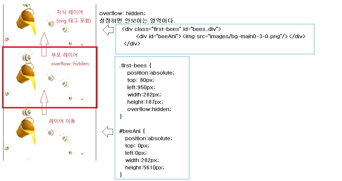
적용 응용분야 (애니메이션)
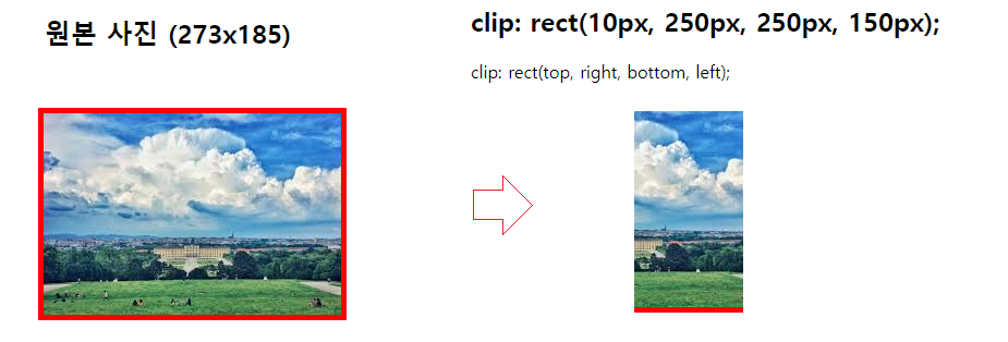
CSS clip Property
CSS clip은 이미지의 일부만을 보여줄 수 있다.
Note: The clip property does not work if "overflow:visible".
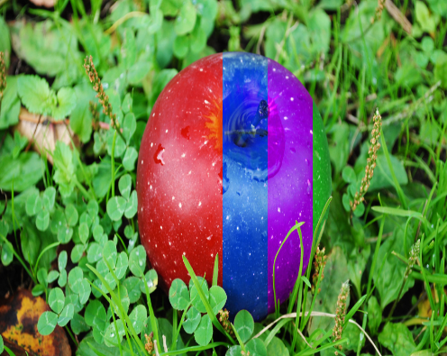
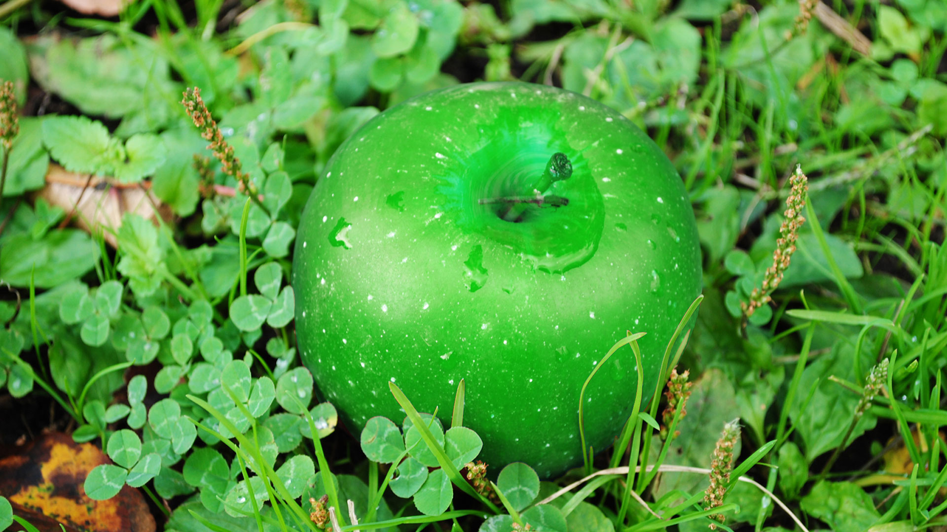
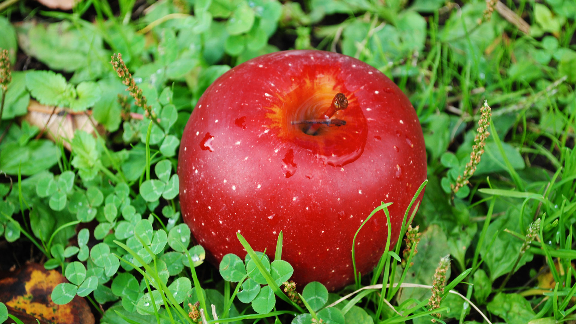
apple-blue.jpg apple-green.jpg apple-purple.jpg apple-red.jpg
<!DOCTYPE html>
<html>
<head>
<style>
.mask {
overflow: hidden;
position: absolute;
top:0;
left:0;
width: 1000px;
height : 800px;
}
.mask img {
width: 100%;
height : 100%;
}
#apple-3{
clip: rect(0px,1000px,800px,700px); //rect(top right bottom left)
}
#apple-2{
clip: rect(0px,1000px,800px,600px); //rect(top right bottom left)
}
#apple-1{
clip: rect(0px,1000px,800px,500px); //rect(top right bottom left)
}
</style>
</head>
<body>
<div class="mask" id="apple">
<div class="mask" id="apple-0">
<img src="apple-red.jpg" alt="" >
</div>
<div class="mask" id="apple-1">
<img src="apple-blue.jpg" alt="">
</div>
<div class="mask" id="apple-2">
<img src="apple-purple.jpg" alt="">
</div>
<div class="mask" id="apple-3">
<img src="apple-green.jpg" alt="">
</div>
</div>
</body>
</html>