display: flex;
최근에는 웹사이트의 레이아웃을 잡기 위해서 float 속성을 잘 사용하지 않는 추세입니다.
대부분의 경우, Flex나 Grid를 요즘에는 더 선호되기 때문이다.
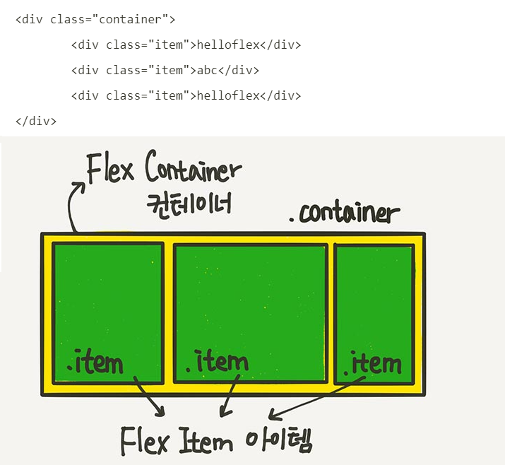
Flex 레이아웃을 만들기 위한 기본적인 HTML 구조는 다음과 같다.
<!DOCTYPE html>
<html>
<head>
<style>
.flex-container {
display: flex;
flex-direction: column;
background-color: DodgerBlue;
}
.flex-container > div {
background-color: #555555;
margin: 10px;
padding: 20px;
font-size: 30px;
}
</style>
</head>
<body>
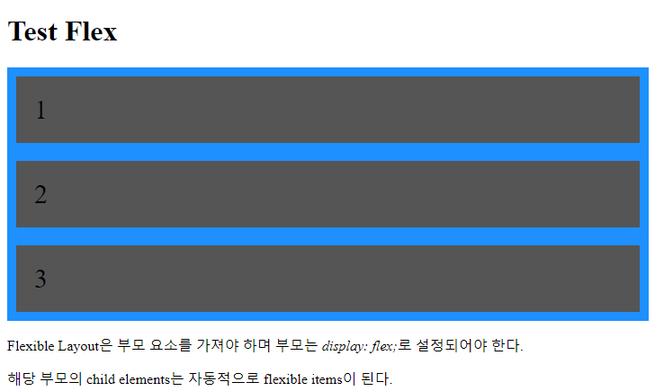
<h1>Test Flex</h1>
<div class="flex-container">
<div>1</div>
<div>2</div>
<div>3</div>
</div>
<p>Flexible Layout은 부모 container 요소를 가져야 하며 부모는 <em>display: flex;</em>로 설정되어야 한다.</p>
<p>해당 부모의 child elements는 자동적으로 flexible items이 된다.</p>
</body>
</html>
1. Container에 적용하는 속성
다음은 flex container(부모 요소에만 적용)에 사용하는 속성들이다.
- flex-direction : 아이템의 배치 방향 (row, column 등)
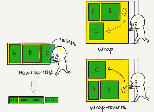
- flex-wrap : 줄바꿈 허용 여부 (nowrap, wrap)
- flex-flow : flex-direction + flex-wrap의 축약형
- justifycontent : 메인(main) 축에서 아이템 정렬 방식
- align-items : 교차(cross) 축에서 아이템 정렬(항상적용) <= stretch 가 기본설정이다.
- align-content : 여러 줄이 있을 때만 여러줄을 묶어서 정렬 ( flex-wrap: wrap이 필수!!)
- gap, row-gap, column-gap : 아이템 사이의 간격
[참고] 메인축과 교차축이란
<!DOCTYPE html>
<html lang="ko">
<head>
<meta charset="UTF-8">
<title>Flexbox 속성 예제</title>
<style>
.container {
display: flex;
/* flex-direction: 행 방향 (기본값은 row) */
flex-direction: row;
/* 줄바꿈 허용 */
flex-wrap: wrap;
/* 위의 두 개를 한 줄로 표현한 축약형 */
/* flex-flow: row wrap; */
/* 메인 축 정렬 방식 (가로 정렬) */
justify-content: center;
/* 교차 축 정렬 방식 (세로 정렬 - 한 줄에 대해) */
align-items: center;
/* 여러 줄이 있을 때, 교차축에서 줄 간 간격을 정렬 */
align-content: space-between;
width: 600px;
height: 300px;
border: 2px solid #000;
background-color: #f5f5f5;
}
.item {
width: 150px;
height: 80px;
margin: 10px;
background-color: coral;
color: white;
font-size: 20px;
text-align: center;
line-height: 80px;
border-radius: 10px;
}
</style>
</head>
<body>
<h2>Flex container의 속성 모두 적용한 예제</h2>
<div class="container">
<div class="item">1</div>
<div class="item">2</div>
<div class="item">3</div>
<div class="item">4</div>
<div class="item">5</div>
<div class="item">6</div>
</div>
</body>
</html>
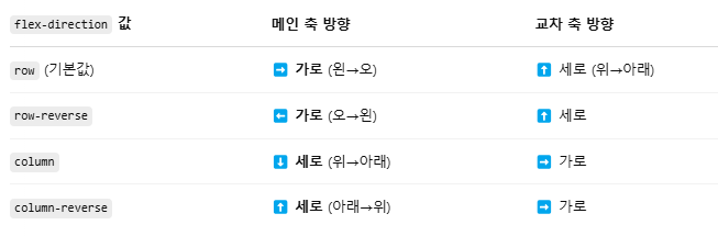
[1] flex-direction Property 어떤 방향으로 flex item을 stack 할 것인지를 설정한다.
flex-direction: row; <== 기본 설정!!
flex-direction: column;
flex-direction: column-reverse;
flex-direction: row-reverse;
[2] flex-wrap Property 줄바꿈 여부를 설정한다.
flex-wrap: wrap;
flex-wrap: nowrap;
flex-wrap: wrap-reverse;
[3] flex-flow Property
flex-direction과 flex-wrap 프로퍼티를 한꺼번에 축약으로 설정한다.
(예) flex-flow: row wrap;
[4] justify-content Property 메인축 정렬방식
https://www.w3schools.com/cssref/playdemo.php?filename=playcss_align-content
justify-content: flex-start; 기본설정, 아이템들을 시작점으로 정렬합니다.
justify-content: flex-end; 아이템들을 끝점으로 정렬합니다.
justify-content: center; 아이템들을 가운데로 정렬합니다.
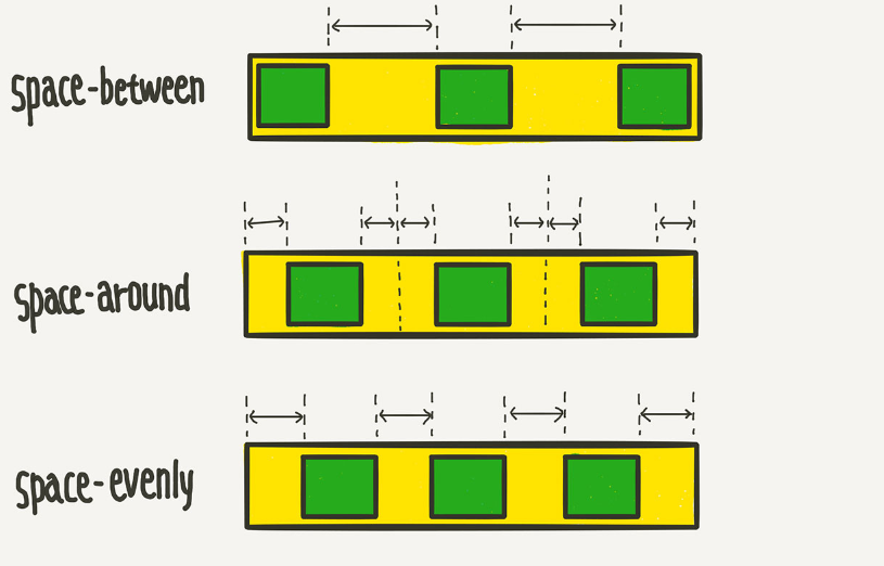
justify-content: space-between; 아이템들의 “사이(between)”에 균일한 간격을 만들어 줍니다.
justify-content: space-around; 아이템들의 “둘레(around)”에 균일한 간격을 만들어 줍니다.
justify-content: space-evenly;
<!DOCTYPE html>
<html>
<head>
<style>
.flex-container {
display: flex;
flex-direction: row;
justify-content: center;
align-items: center;
background-color: DodgerBlue;
height: 360px;
}
.flex-container > div {
background-color: #f1f1f1;
width: 100px;
height: 80px;
margin: 10px;
text-align: center;
line-height: 75px;
font-size: 30px;
}
</style>
</head>
<body>
<h1>justify-content</h1>
<p>"justify-content: center;"는 수평 정렬을, "align-items: center;"는 수직 정렬을 담당합니다.</p>
<div class="flex-container">
<div>1</div>
<div>2</div>
<div>3</div>
</div>
</body>
</html>
justify-content: center; 정렬모습 ( flex-direction: row;인 경우)

[5] align-items Property 교차축 방향으로 개별 아이템들을 정렬하는 속성이다
https://www.w3schools.com/cssref/playdemo.php?filename=playcss_align-items
align-items: stretch; 기본설정, 아이템들이 수직축 방향으로 끝까지 쭈욱 늘어납니다.
align-items: flex-start; 아이템들을 시작점으로 정렬합니다.
align-items: flex-end; 아이템들을 끝으로 정렬합니다.
align-items: center; 아이템들을 가운데로 정렬합니다.
align-items: baseline; 아이템들을 텍스트 베이스라인 기준으로 정렬합니다.
아래와 같이 두개의 속성을 함께 사용하면 좌우상하 중앙에 배치된다.
flex-direction: row;
justify-content: center;
align-item: center;
<!DOCTYPE html>
<html>
<head>
<style>
.flex-container {
display: flex;
height: 400px;
align-items: center;
background-color: DodgerBlue;
}
.flex-container > div {
background-color: #f1f1f1;
width: 100px;
margin: 10px;
text-align: center;
line-height: 75px;
font-size: 30px;
}
</style>
</head>
<body>
<h1>The align-items Property</h1>
<p>The "align-items: center;" aligns the flex items in the middle of the container:</p>
<div class="flex-container">
<div style="height:100px">1</div>
<div style="height:200px">2</div>
<div style="height:300px">3</div>
</div>
</body>
</html>
align-content
줄이 여러 개 있을 때만 작동합니다 (flex-wrap: wrap이 필수)
align-items는 "한 줄 내 개별 아이템 정렬"이며 align-content는 "여러 줄 전체 묶음을 정렬"하는 속성이다.
아래 예제는 한줄에 있을 때 적용이 안되지만 윈도우 크기를 줄이면 여러줄이 될 때 align-content가 동작한다.
<!DOCTYPE html>
<html lang="ko">
<head>
<meta charset="UTF-8">
<title>CSS 상속 확인 예제</title>
<style>
.container {
display: flex;
flex-wrap: wrap; /* 줄 바꿈 허용 */
align-content: center; /* 여러 줄 묶음 전체를 수직 중앙 정렬 */
height: 300px;
border: 1px solid #aaa;
}
.item {
width: 100px;
height: 50px;
background: lightblue;
margin: 10px;
}
</style>
</head>
<body>
<div class="container">
<div class="item"></div>
<div class="item"></div>
<div class="item"></div>
<div class="item"></div>
<div class="item"></div>
<div class="item"></div>
</div>
</body>
</html>
2. flex item에 사용하는 속성
- order
- flex-grow
- flex-shrink
- flex-basis
- flex
- align-self
[1] order Property
<!DOCTYPE html>
<html>
<head>
<style>
.flex-container {
display: flex;
align-items: stretch;
background-color: #f1f1f1;
}
.flex-container>div { /* 직계자식*/
background-color: DodgerBlue;
color: white;
width: 100px;
margin: 10px;
text-align: center;
line-height: 75px;
font-size: 30px;
}
</style>
</head>
<body>
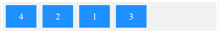
<h1>The order Property</h1>
<p>Use the order property to sort the flex items as you like:</p>
<div class="flex-container">
<div style="order: 3">1</div>
<div style="order: 2">2</div>
<div style="order: 4">3</div>
<div style="order: 1">4</div>
</div>
</body>
</html>
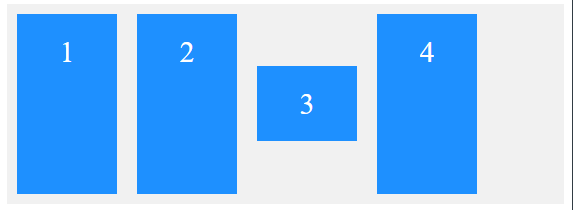
[2] flex-basis Property
Flex 아이템의 최저 기본 크기를 설정합니다(flex-direction이 row일 때는 너비, column일 때는 높이).
<!DOCTYPE html>
<html>
<head>
<style>
.flex-container {
display: flex;
align-items: stretch;
background-color: #f1f1f1;
}
.flex-container > div { /* 직계자식*/
background-color: DodgerBlue;
color: white;
width: 100px;
margin: 10px;
text-align: center;
line-height: 75px;
font-size: 30px;
}
</style>
</head>
<body>
<h1>The flex-basis Property</h1>
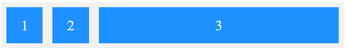
<p>Set the initial length of the third flex item to 200 pixels:</p>
<div class="flex-container">
<div>1</div>
<div>2</div>
<div style="flex-basis:200px">3</div>
<div>4</div>
</div>
</body>
</html>
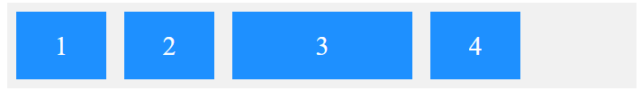
[3] flex-grow Property
아이템의 크기가 상대적으로 weight 비율로 전체크기의 상대 비율로 크기가 결정된다.
<!DOCTYPE html>
<html>
<head>
<style>
.flex-container {
display: flex;
align-items: stretch;
background-color: #f1f1f1;
}
.flex-container > div {
background-color: DodgerBlue;
color: white;
margin: 10px;
text-align: center;
line-height: 75px;
font-size: 30px;
}
</style>
</head>
<body>
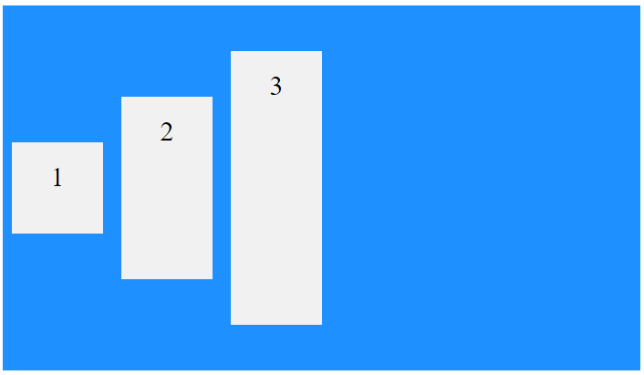
<h1>The flex-grow Property</h1>
<p>Make the third flex item grow eight times faster than the other flex items:</p>
<div class="flex-container">
<div style="flex-grow: 1">1</div>
<div style="flex-grow: 1">2</div>
<div style="flex-grow: 8">3</div>
</div>
</body>
</html>
1 : 1 : 8 의 크기가 된다.
[4] flex-shrink Property
flex-shrink는 Flexbox에서 아이템이 공간이 부족할 때 얼마나 줄어들 수 있는지를 정해주는 속성입니다.
flex-shrink는 flex-grow와 대칭을 이루는 속성으로, 아이템이 flex-basis의 값보다 작아질 수 있는지를 결정한다.
flex-shrink는 0보다 큰 값이 세팅이 되면 해당 아이템이 유연한(Flexible) 박스로 변하고
flex-basis보다 브라우저 크기에 따라서 기본크기보다 작아질 수 있다.
기본값이 1 이기 때문에 따로 세팅하지 않았어도 아이템이 flex-basis보다 작아질 수 있다.
값 의미
0 절대 줄어들지 않음
1 이상 컨테이너가 작아질 경우, 비율대로 줄어듦
<!DOCTYPE html>
<html>
<head>
<style>
.flex-container {
display: flex;
align-items: stretch;
background-color: #f1f1f1;
}
.flex-container>div {
background-color: DodgerBlue;
color: white;
width: 100px;
margin: 10px;
text-align: center;
line-height: 75px;
font-size: 30px;
}
</style>
</head>
<body>
<h1>The flex-shrink Property</h1>
<p>Do not let the third flex item shrink as much as the other flex items:</p>
<div class="flex-container">
<div>1</div>
<div>2</div>
<div style="flex-shrink: 0">3</div>
<div style="flex-shrink: 1">4</div>
<div style="flex-shrink: 3">5</div>
<div>6</div>
<div>7</div>
<div>8</div>
<div>9</div>
<div>10</div>
</div>
</body>
</html>
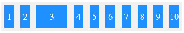
3번째 Item은 작아지지 않는다. 숫자가 클수로 빨리 작아진다.
[5] flex Property 한 번에 쓸 수 있는 축약형 속성
flex-grow, flex-shrink, flex-basis를 한 번에 쓸 수 있는 축약형 속성이다.
flex: 1; /* flex-grow: 1;flex-shrink: 1; flex-basis: 0%; */
flex: 1 1 auto; /* flex-grow: 1; flex-shrink: 1; flex-basis: auto; */
flex: 1 500px; /* flex-grow: 1; flex-shrink: 1; flex-basis: 500px; */
[6] align-self Property
https://www.w3schools.com/cssref/playdemo.php?filename=playcss_align-self
개별 아이템 하나만 다른 정렬을 하고 싶을 때 사용하는 속성입니다.
Flex 컨테이너 안의 특정 아이템 하나에만 교차축 정렬을 개별 지정할 수 있게 해주는 속성입니다.
즉, align-items는 모든 아이템에 공통 적용하지만
align-self는 특정 아이템 하나만 다르게 정렬할 수 있어요.
align-self: auto;
align-self: stretch;
align-self: flex-start;
align-self: flex-end;
align-self: center;
align-self: baseline;
<!DOCTYPE html>
<html>
<head>
<style>
.flex-container {
display: flex;
height: 200px;
background-color: #f1f1f1;
}
.flex-container > div {
background-color: DodgerBlue;
color: white;
width: 100px;
margin: 10px;
text-align: center;
line-height: 75px;
font-size: 30px;
}
</style>
</head>
<body>
<h1>The align-self Property</h1>
<p>The "align-self: center;" aligns the selected flex item in the middle of the container:</p>
<div class="flex-container">
<div>1</div>
<div>2</div>
<div style="align-self: center">3</div>
<div>4</div>
</div>
<p>The align-self property overrides the align-items property of the container.</p>
</body>
</html>
align-items는 설정하지 랂으면 교차(cross) 축 stretch 가 기본설정이다.
위 예제의 아이템들은 기본적으로 align-items: stretch가 적용되어 세로로 꽉 채움
==>다른 아이템은 여전히 위쪽부터 아래까지 전체 높이만큼 늘어남 (stretch)
==> 3번 박스만 세로 방향(교차 축)의 가운데에 배치함 (중앙에 떠 있는 것처럼 보임)
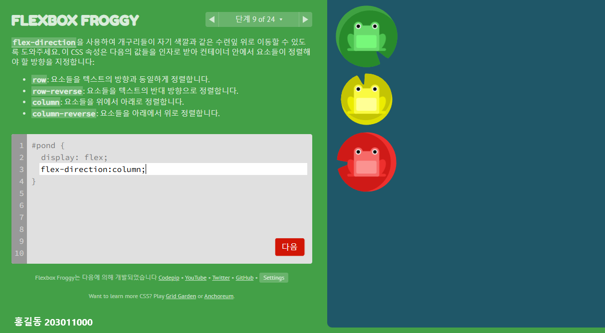
Flexbox Froggy란 ?
https://flexboxfroggy.com/#ko
CSS코드 게임으로 Flexbox의 속성을 요구한대로 입력하면 다음 단계로 넘어갈 수 있는 게임
Flexbox의 속성을 실습하며 익히기 좋다.
[문제풀이] https://velog.io/@hamham/Flexbox-Froggy-%EB%AC%B8%EC%A0%9C%ED%92%80%EC%9D%B4
[참고] https://www.flexboxdefense.com/
다음과 같이 24단계 모두 스크린삿 + 이름(학번) 하여 하나의 zip 파일로 제출한다.